Background
Initial Tests & Look Development
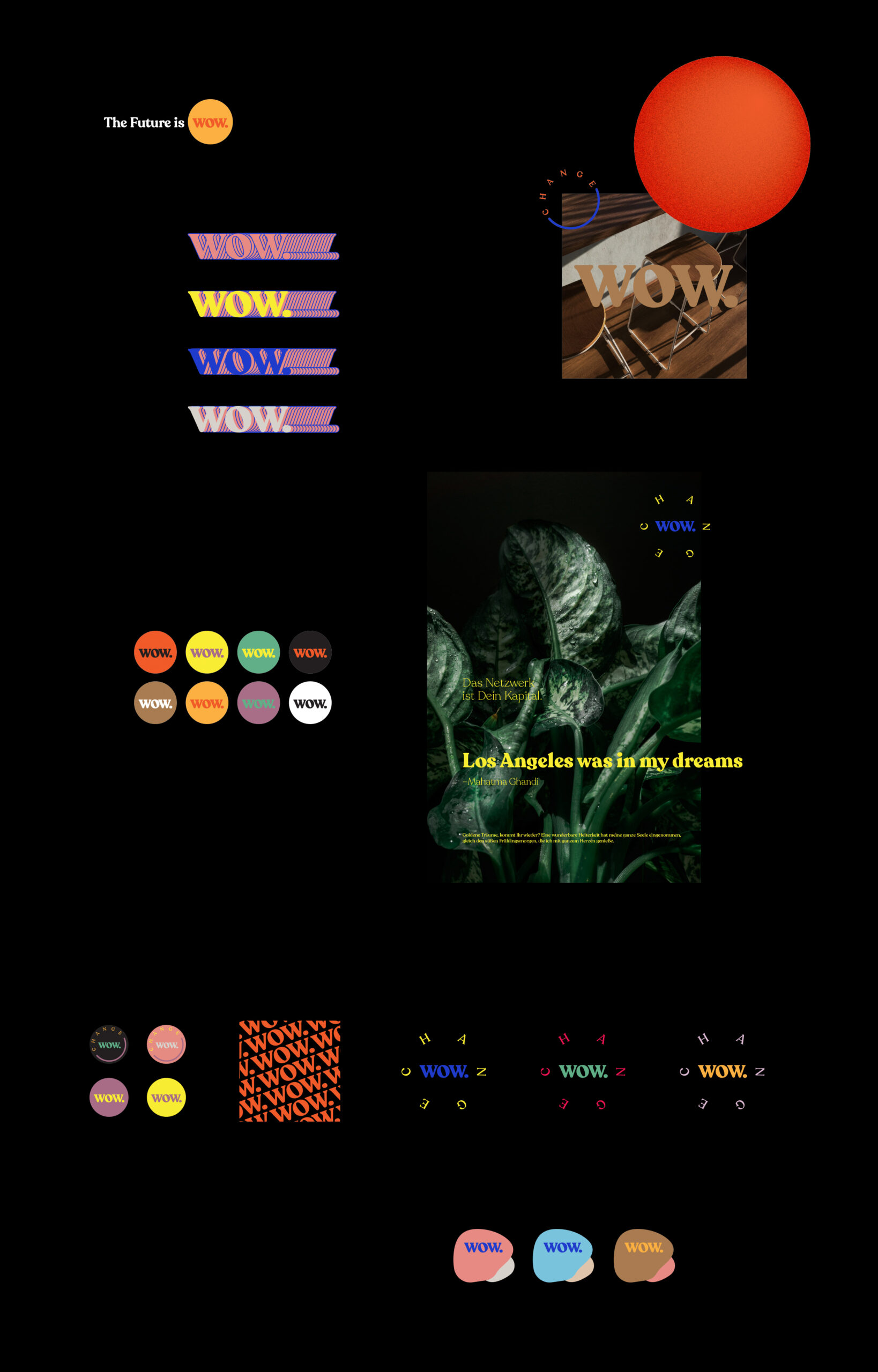
Targeting young urban professionals just like well established but only mildly interested grown ups WOW.change needed a fresh yet accessible and modern appearance. A distinct logo design and a vibrant color palette were crucial in order to set up WOW. as a Trojan Horse – lovely, engaging and flat out serious.
Visual Language
I wanted WOW. to be a flexible and even fluid multi platform brand. No boring guidelines, no boundaries. The hidden agenda was to create an onboarding system for casual bystanders with my wife being an online activist at its core. Think street art for the digital space – polymorphic and diverse. Hence I developed digital stickers and tags to enable Oranna as well as potential collaborators to go full force online guerilla marketing.

Pebbels, Mezzotint & Typography
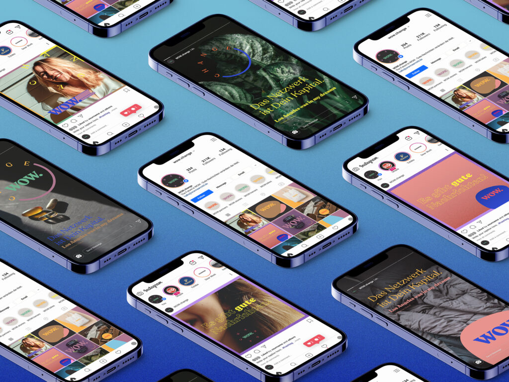
In addition to the visual language WOW.change needed a strong set of tools enabling Oranna to create recognizable and professional content right off the cuff. ‘Pebbles’ allow her to put a WOW. on virtually any background branding photos and illustrations almost instantly with minimal layout knowledge. A mezzotint effect gives design elements a natural feel and Recolettas many typefaces help communicate bold statements as well as substantial content with ease.
Instagram Tools
Rollout - In the Wild


